

Wholesale Color Box Ideas to Elevate Your Product Packaging
2026-09-25
Think of the last time a package made you pause before opening it. Chances are, color was working on you long before the product did. Wholesale color boxes are one of the most underused levers in packaging—most brands treat them as an afterthought, not a strategy. Kuaijie Carton works with brands to flip that script, using color to command shelf presence and build recognition at the unboxing moment. The ideas below are built from real production runs, not mood boards.
Rethinking the Brown Box: Color Choices That Command Attention
The default kraft carton has become a silent placeholder. When every shipment arrives in the same muted tan, the moment of arrival loses any sense of occasion. Swapping that tired brown for a saturated cobalt or a warm coral doesn’t just alter the exterior—it changes how people reach for the package before they even know what’s inside. Color is the first handshake, and a bold one keeps the grip.
There’s a practical argument too. In a distribution hub or a cluttered porch, a high-contrast hue pulls the eye away from background noise. But this isn’t about shouting with neon for its own sake. A deep forest green can signal care, while a matte black suggests restraint and premium intent. The trick is choosing a tone that matches the promise inside, then pushing it slightly further than feels safe.
The shift doesn’t demand a complete redesign. Even a single accent panel, a colored tape, or a gradient printed on the interior flaps can reframe the same box as something memorable. When the package is worth keeping—or at least worth photographing—the color becomes part of the product story, not just a shipping afterthought.
Wholesale Color Box Strategies That Feel Custom, Not Cookie-Cutter
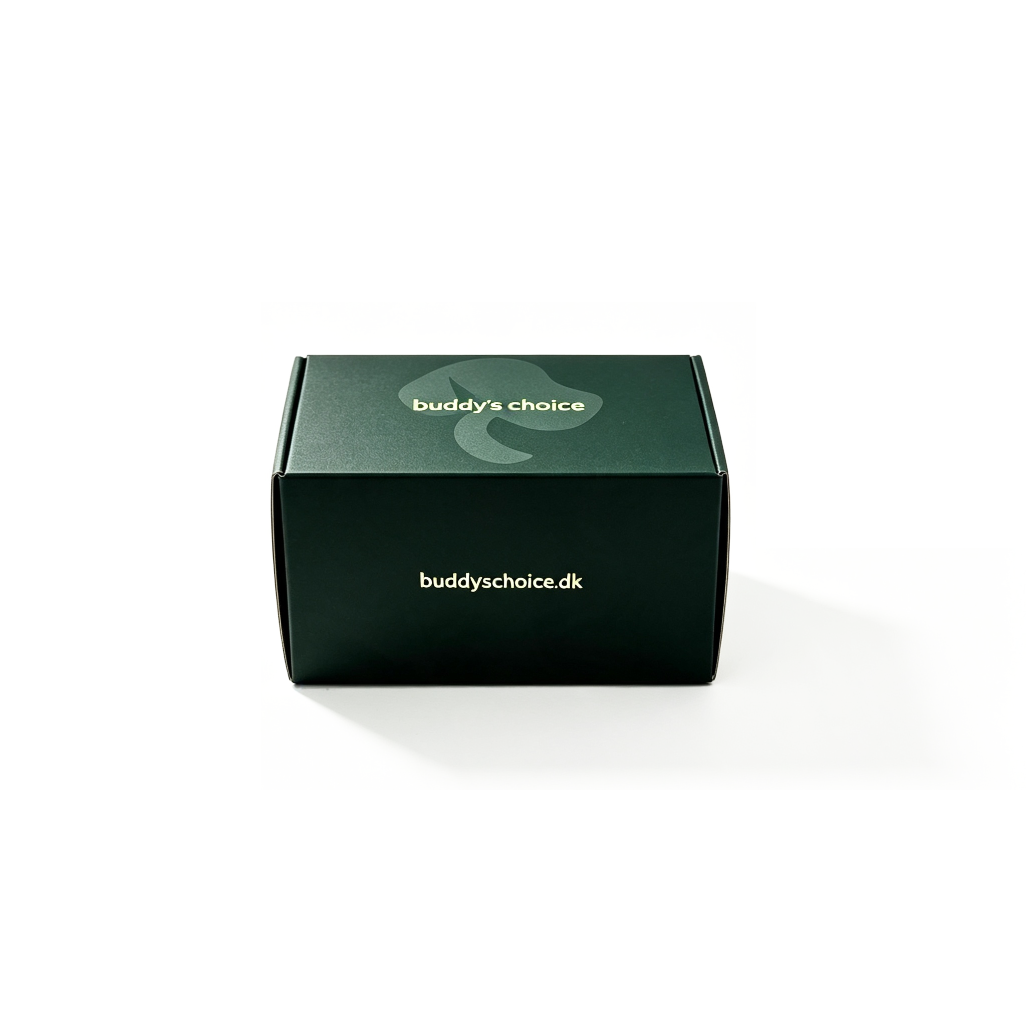
The real trick to wholesale color boxes that don't feel mass-produced is treating your packaging like a chameleon. Instead of locking into one rigid color scheme, build a modular system where a neutral base box gets dressed up with interchangeable sleeves, belly bands, or sticker sets in limited-edition palettes. A stationery wholesaler we work with rotates four seasonal palettes on the same kraft box, and their buyers consistently comment that each drop feels like a small-batch release—even though the core carton never changes. This approach lets you offer variety without bloating your inventory or minimum order quantities.
Another lever is letting color do the storytelling through unexpected pairings rather than generic brand hues. Think of a matte sage green box with a burnt orange interior flap, or a soft lavender exterior paired with a bold cobalt tissue liner. These are combinations that rarely show up in bulk packaging catalogs, so they instantly read as considered rather than off-the-shelf. One jewelry brand we know prints the inside of their wholesale boxes in a different shade every production run—same outside, fresh surprise inside. It costs pennies per unit but makes unboxing feel like a discovery, not a transaction.
Finally, resist the urge to over-explain your color choices with trendy names or marketing speak. Let the box itself carry the nuance. A muted terracotta with a subtle texture says more about your brand than calling it "desert sunset." Wholesale buyers are tired of seeing the same Pantone swatches repeated across every trade show aisle. By mixing low-key finishes—soft-touch coatings, slight gradients, or a single printed accent line in an off-register color—you create a box that feels like it was designed for a specific product, not pulled from a warehouse shelf. That perceived intention is what separates custom-feeling packaging from cookie-cutter stock.
How to Use Color Psychology to Boost Bulk Packaging Appeal
Bulk packaging often gets treated as a purely functional afterthought—plain cardboard, basic labels, nothing that asks for a second glance. But color is one of the cheapest tools you have to change that. Warm tones like deep orange or rich red can make a pallet or bin feel more energetic and approachable, while cool blues and greens hint at calm, trust, or natural origins. The trick is to match the emotional signal to the product inside. A fifty-pound sack of flour doesn't need neon pink; a soft cream or warm beige can suggest freshness and simplicity without shouting.
Think about what your buyers already associate with the category. If you sell bulk coffee beans, a dark brown with subtle gold accents can reinforce richness and premium quality. For cleaning supplies or industrial goods, a clean white base with a single bold stripe of blue or green can signal hygiene and efficiency. Don't try to make every color mean everything—pick one primary emotional cue and let the rest of the packaging stay quiet. This restraint often stands out more than a rainbow label, especially when competitors are all using the same generic brown boxes.
Finally, test color choices in the actual retail or warehouse environment. A color that looks great on a digital mockup might fade under fluorescent lighting or get lost next to a bright competitor. Take a few sample bags or boxes to the floor, set them where they would normally sit, and step back. Ask a handful of customers or staff which one they notice first and why. Small tweaks—like deepening a shade or adding a thin contrasting border—can lift perceived value without changing the product at all. Over time, these color decisions become part of your brand's shorthand, making repeat purchases feel familiar and intentional.
Bold Hues, Low Minimums: Making Every Package a Brand Moment
When minimum order quantities drop, the fear of committing to a bold color scheme disappears. You can test a vivid orange mailer or a deep teal box without worrying about warehousing hundreds of leftovers. That freedom invites brands to treat packaging like a canvas, not a commodity.
A punchy hue does more than catch the eye on a shelf or a doorstep—it becomes a quiet signature. Even a small run of envelopes in an unexpected shade tells customers you cared enough to skip the plain kraft default. That visual consistency, repeated across every shipment, turns routine deliveries into tiny, memorable brand encounters.
Low minimums also mean you can refresh those colors seasonally or experiment with limited-edition palettes without sunk costs. Each package leaves your hands as a deliberate statement, not an afterthought, and the recipient feels that intention the moment they open the door.
The Rise of Insta-Worthy Packaging: Color Boxes Worth Sharing
Unboxing has turned into a spectator sport, and the box itself is now the opening act. A flat, forgettable brown carton rarely makes it into a feed, but a color box with a gradient that shifts from coral to fuchsia or a lid printed with a geometric pattern gets photographed before the product even appears. The packaging sets the mood before a single item is touched. When a brand wraps its goods in a box that feels like a gift, customers do the marketing by posting it.
Printing technology deserves some credit for this shift. High-quality offset and digital presses can now handle ultra-vivid Pantone shades, soft-touch matte coatings, and even spot UV details that catch the light. These finishes make a box feel less like a container and more like a keepsake. Small and mid-size brands are investing in custom color boxes because the cost per share on social platforms is far lower than a traditional ad campaign, and the return feels more personal.
Certain color choices have become signals in their own right. Millennial pink still reads as playful and approachable, while a deep forest green suggests sustainability and calm. A bright marigold or electric blue demands attention in a crowded photo grid. The smartest brands don't just pick a trendy hue; they pick one that aligns with the customer's identity, so sharing the package feels like sharing a part of themselves. That emotional hook turns a simple box into a status object worth posting.
Smart Savings, Stunning Presentation: A Buyer's Guide to Color Boxes
When you're sourcing color boxes, the temptation is to chase the lowest unit price and call it a day. But smart savings come from looking at the whole lifecycle of the packaging—material thickness, print coverage, and structural design all affect how many units survive shipping and how your product looks on the shelf. A box that collapses or fades after one trip to the retail floor costs far more in returns and lost brand trust than the few cents you shaved off upfront.
Presentation is where a color box earns its keep. It's the first physical touchpoint between your customer and your product, so details like the finish—glossy, matte, or soft-touch—and the quality of the die-cut edges matter more than a busy design. Instead of piling on foil stamping and embossing just because they're available, think about what creates contrast and guides the eye: a single bold accent on a clean background often reads as more premium than an over-decorated surface.
To balance both sides, ask your supplier for a physical sample before bulk production. Check the folding score lines, the color consistency across panels, and how the box feels when opened. If the sample looks rushed or flimsy, negotiating a lower price won't fix it. Buyers who treat the color box as a functional sales tool rather than a commodity usually end up with packaging that stays closed in transit, opens beautifully in hand, and keeps the price per unit reasonable over repeat orders.
FAQ
Look at the shelf before you pick a single swatch. Most categories lean on blues, whites, or muted earth tones, so stepping into something like a warm coral, deep teal, or mustard can instantly pull the eye. Also test your box under the same lighting as the store, not just in your office, because fluorescent or warm bulbs can shift how a color reads.
Try dividing the box with a diagonal or asymmetric split instead of straight horizontal bands. You can also use a bold color on the inside tray and keep the outside mostly neutral for a surprise opening moment. Another approach is pairing a matte color block with a small glossy same-color logo, which creates depth without adding a new color to the palette.
Quietly saturated mid-tones like forest green, rust, dusty plum, and ochre are replacing neon and pastel fatigue. Duotone pairings, such as terracotta with deep navy or sage with charcoal, feel current but still grounded. Texture also matters more than exact hue, so a tactile uncoated stock in a rich color often looks more premium than a high-gloss bright.
Anchor one bold hue with two neutrals or a deep tone from the same family. For example, a vivid orange box can still feel refined if the logo and product details are printed in dark brown or off-white. Also limit the bold color to a single panel or the interior, while keeping the main face clean and minimal.
Offset printing with Pantone spot colors gives the most reliable consistency for large runs, especially if your brand color needs to match exactly. If your budget is tighter, digital printing has improved a lot and works well for shorter runs, but ask the supplier to run a color draw-down before the full production so you see how the ink sits on the actual board.
Yes, many recycled and FSC-certified boards now take ink beautifully, so you won't be stuck with muddy tones. The main limitation is that uncoated or lightly coated eco-friendly stock can mute very bright or neon colors, so adjust your palette to slightly deeper or more natural shades. Water-based inks and soy-based inks also help keep the box easy to recycle.
Ask for a physical hard proof or a press proof on the same material that will be used for the run. Digital screens always distort color, so screen proofs are only a rough guide. Also provide the supplier with Pantone codes or CMYK values rather than just a photo, and set a tolerance range for color variation before signing off.
Yes, you can create a color system where each line gets its own accent color while keeping the logo placement, typography, and layout identical. This builds product recognition while still making each variant easy to spot. The key is consistency in structure, because too many unrelated color and layout changes will break the visual link between your products.
Conclusion
Plain brown boxes have long been the default for bulk shipping, but they rarely earn a second glance. A shift toward saturated teals, warm corals, or deep mustard can make even a simple mailer feel intentional. The trick is not to drown every panel in color—use bold hues on the lid or a contrasting interior flap, and let the rest stay neutral. Wholesale suppliers increasingly offer low minimums and a range of stock color options, which means you can mix and match without committing to a full custom run. That flexibility turns a standard order into something that feels curated rather than cookie-cutter. Small runs of color boxes no longer mean settling for someone else's palette.
Color psychology does real work at the unboxing moment: greens and blues signal calm or trust, while reds and oranges create urgency and energy. A thoughtfully selected color box can lift perceived value before the product is even touched, and buyers notice when packaging is shareable enough for social feeds. You do not need an oversized budget—many wholesale programs allow you to pair a single bold accent with minimalist typography, achieving a high-end look at a fraction of custom pricing. That result is packaging that works harder: protecting the product, reinforcing your brand, and making every delivery feel like a deliberate brand moment. It is a low-risk way to test what resonates with your audience before scaling up.
Contact Us
Contact Person: Tan Xiang
Email: [email protected]
Tel/WhatsApp: 8613798906863
Website: https://www.dgkjzx.com